|
I finally have a Friday Post to make again. Huzzah. This is essentially just a folding collage. My process for making this was more or less to create some theme or message throughout the book. This work in progress image does not truly do it justice, but the message of this was to transition from boring, pretentious textbook pages into true life and art. 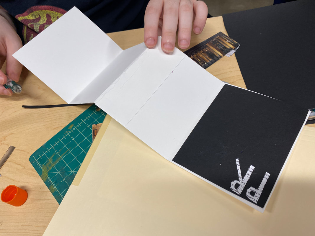
0 Comments
Due to technical difficulties, we still have 0 access to the art computers. However, I was given an optional assignment to create a design to poke fun at our inability to make proper designs. As such, this is a parody of graphic design and is designed to be as much of an eye sore as possible. In that spirit, the main text is in comic sans, there is a rainbow gradient, centering does not exist, shapes are not symmetrical, and spelling mistakes are prevalent. These are only a few of the things that make this image so painful to look at. Enjoy.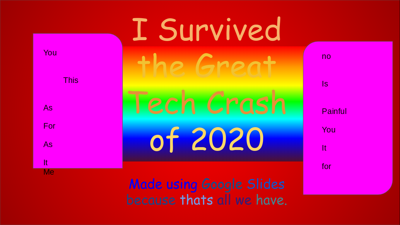 As the computers with adobe installed are still down, we have been relegated to the dark recesses of Google Slides for our design work. Frankly, it's not that bad, however. The goal was to use squares to demonstrate different elements of graphic design, those being Order, Bold, Playful, and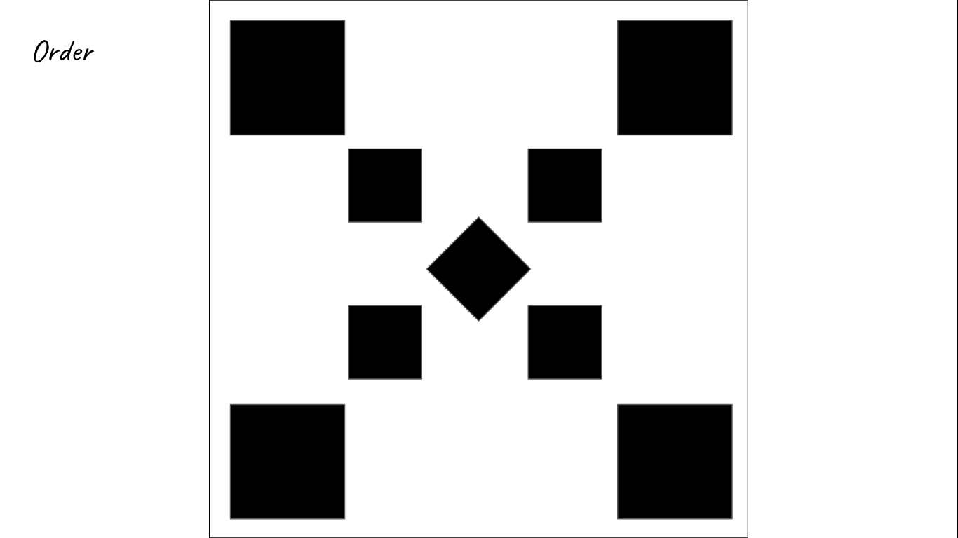 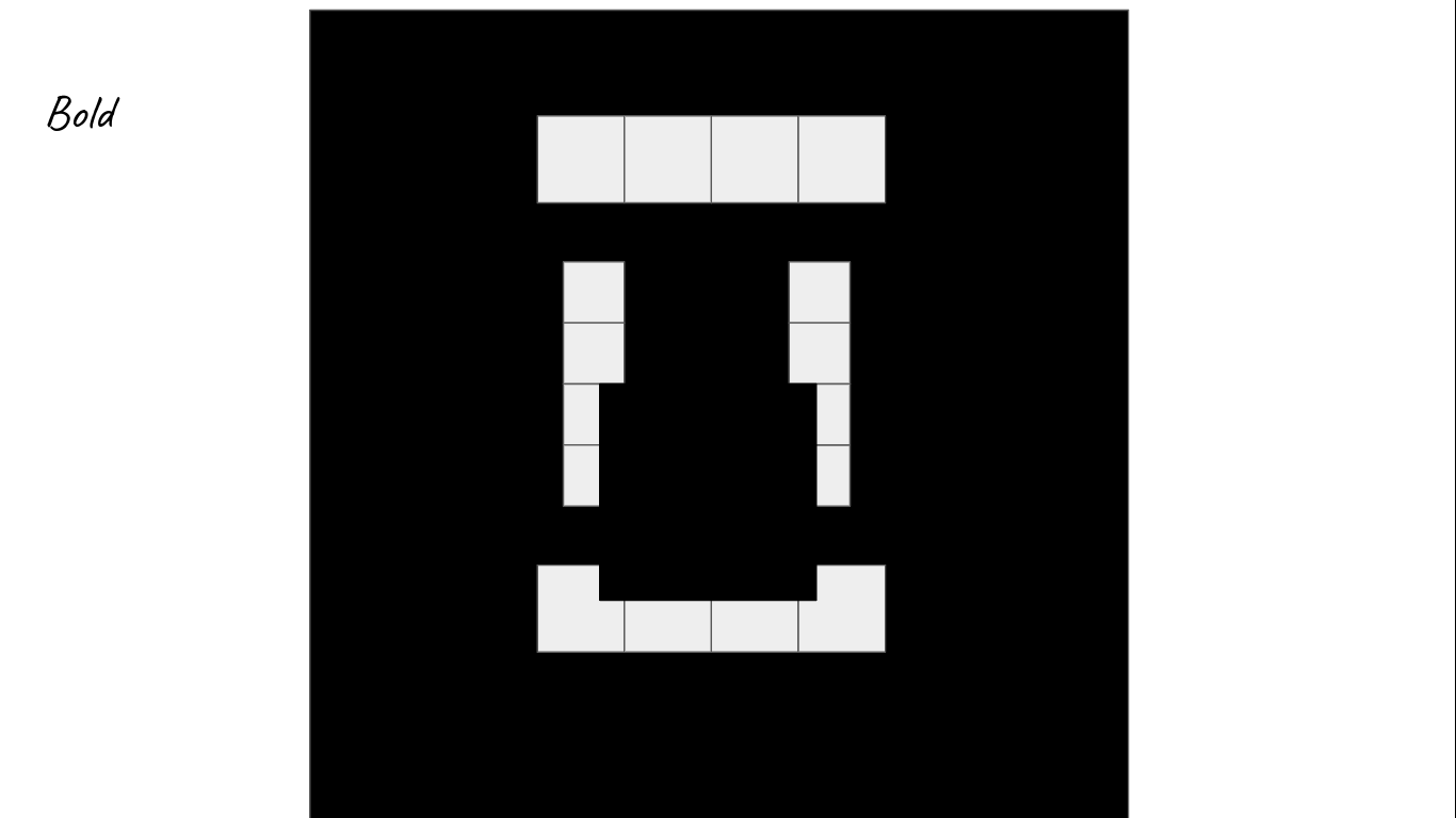 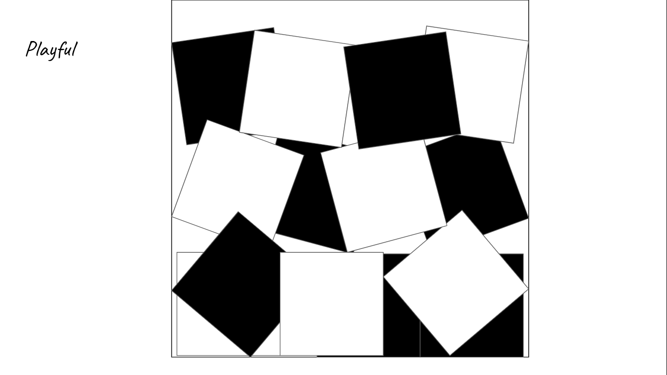 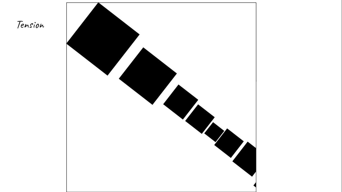 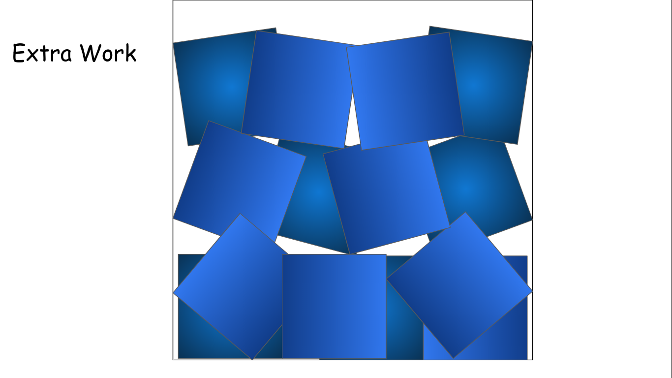 Well, recent events have ground most things to a screeching halt. Luckily, we could still do something useful to do with our time. As we cannot use Adobe Illustrator for the time being, we all tried our hand at Adobe Spark, which we could access through chrome. Our task was to create posters generating buzz for the upcoming Spark Art Show in February. I thought of some inspirational quote myself but added my own little flare of lightheartedness with that little message at the bottom, since we will, indeed, have snacks at the art show. I would add a picture to the image but Spark was being weird and would not let the picture so much. Frankly, I did not like using Spark at all. Many of the functions are overly complex, with there being little to no indication of how different tools work. This, compounded with the slow speed of our chrome books and the overall glitches in the program, led to a wholly bad experience. On the bright side, there was a wide array of fonts to use for text, and you could add some neat backgrounds to your text... when the tools worked. That's more or less it, so goodbye for now. 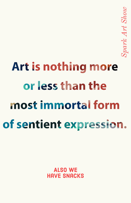 I am about halfway done with the whole lines project. It has been quite difficult, in no small part due to simple technical difficulties. Unfortunately, I didn't learn much that was new or helpful besides the "snap to grid" function, though it was good for refreshing my memory as to the basics of Illustrator. I still have a great deal of work to do, though, in the form of lines 3, the sequel to the poorly received lines 2. Until next time. 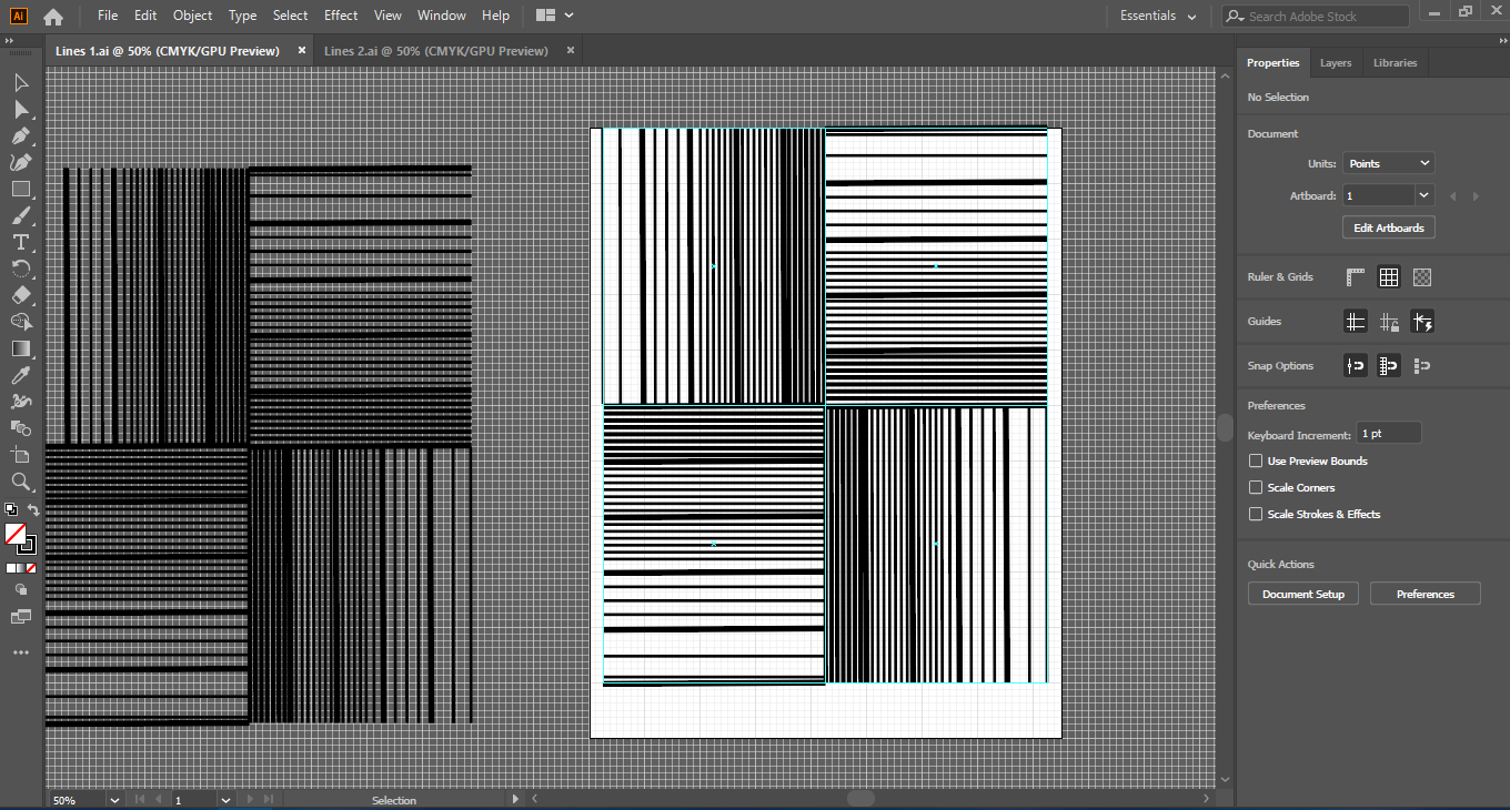 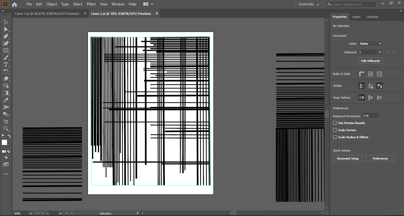 |
AuthorHigh School Graphic Design Student. ArchivesCategories |
 RSS Feed
